40 years after, the secrets of a now-iconic logo
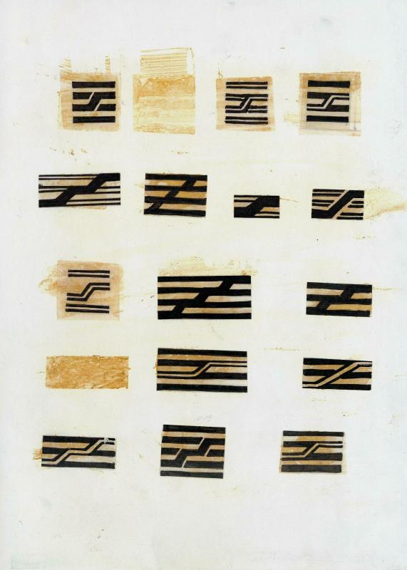
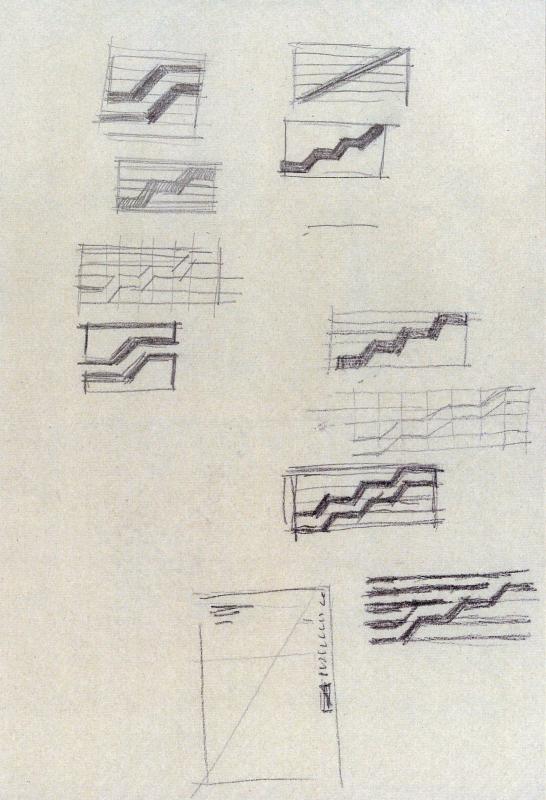
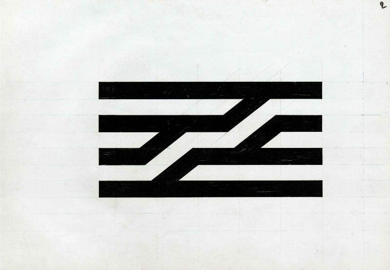
It was on the corner of a paper tablecloth that one of the world’s most recognisable logos took shape. Seated at a café terrace opposite a Centre Pompidou still under construction, the graphic designer Jean Widmer (d. 2026) sketched it out in a few pencil strokes. Six black bands crossed by two zigzags, inspired by the famous “Chenille” – the escalator climbing the building’s façade. A play between void and solid, no outlines. Pure reduction.
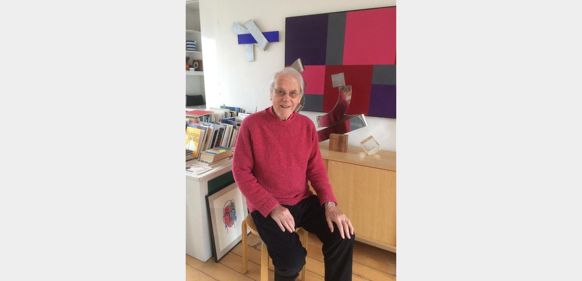
Now in his nineties, the Swiss-born designer recalled: “It’s the logo I drew the fastest in my entire career. I already had it in my head.” Widmer’s stroke of genius? Drawing directly on the building’s structure to distil its mission: multidisciplinarity and openness. Since that day in 1977, Widmer’s logo has travelled the world, weathering the decades without ever losing its graphic force.
It's the fastest logo I ever designed. I already had it in mind.
Jean Widmer
In October 2019, the Centre Pompidou even chose to return to the original version – five black lines instead of six. This was the designer’s first proposal: less massive, lighter. A change in continuity, but above all a tribute to the creator’s original vision. At the time, Widmer had been forced to bow to the demands of decision-makers, who insisted that the logo feature the same number of levels as the building itself.
Although Widmer’s creation is now inseparable from the Centre Pompidou’s visual identity, its adoption was far from a given. In the 1970s, cultural marketing had yet to take hold, and adopting a logo still seemed uncomfortably close to advertising. And yet, as early as 1974 – while the building site was still underway – a consultation was launched to define the Centre Pompidou’s “brand image”.
Although Widmer’s creation is now inseparable from the Centre Pompidou’s visual identity, its adoption was far from a given. In the 1970s, cultural marketing had yet to take hold, and adopting a logo still seemed uncomfortably close to advertising.
This unprecedented initiative brought together some of the leading talents of the time: Belgian graphic designer Michel Olyff, Polish artist Roman Cieslewicz, British designer Henri Kay Henrion, Swiss typographer Adrian Frutiger, Italian designer Massimo Vignelli, and the Swiss-born Jean Widmer. Around fifteen participants worked on every component of what would become the Centre Pompidou’s visual identity, in close collaboration with the building’s architects, Renzo Piano and Richard Rogers. The brief was clear: to conceive “unity in diversity” and to invent nothing less than “a machine for communication”.
The jury – made up of the presidents of the Centre Pompidou’s various departments (including Pierre Boulez, from Ircam, the Institute for Research and Coordination in Acoustics/Music) – was chaired by Willem Sandberg, typographer and former director of the Stedelijk Museum in Amsterdam, a global reference in contemporary museography.
Knowing that the jury would be gathered around a gigantic conference table, Widmer, his partner Ernst Hiestand, and the team from the VDA agency (Visual Design Association) opted for a Japanese-style A3 leporello format – folded, expandable, a single strip of paper nearly twenty metres long. Their graphic proposal was disarmingly simple: a colour code for each department of the Centre Pompidou – visual arts in red, the Centre de Création Inductrielle in blue, the Bibliothèque publique d'information in green, Ircam in violet, and shared spaces in yellow.
Widmer recalls: “One day I receive a letter from Boulez, complaining about the colour chosen for Ircam. He found it ‘hideous and crepuscular.’ So I show him a Pantone swatch book with 1,500 colours and explain that the departments’ colours are spaced at equal intervals around the colour wheel. After making our way through the swatches – red already taken – I suggest purple. And suddenly, he agrees!”
Widmer then announces the news to Pontus Hultén, the director of the Musée national d’art moderne at the time, who replies: “But Widmer, it’s the same colour as before!” Which, in fact, it was. Clever Widmer. Another of the designer’s bold ideas was to propose vertical signage panels – an innovation that initially gave Pontus Hultén a literal pain in the neck. Jokingly, Hultén took to greeting Widmer with his head tilted and lips pursed – before eventually declaring the idea brilliant.
© Centre Pompidou / Dist. Rmn-Gp
© Centre Pompidou / Dist. Rmn-Gp
© Centre Pompidou / Dist. Rmn-Gp
- logo 1 (copie 1)
- logo 2 (copie 1)
- logo 3 (copie 1)
Though now inseparable from the Centre Pompidou, this design icon very nearly vanished at the turn of the millennium. In the late 1990s, the building was due for a long-overdue facelift, and the Centre Pompidou closed its doors to the public. Jean-Jacques Aillagon, then president of the institution, seized the moment to rethink its visual identity. Renzo Piano, overseeing the renovation, turned to the Swiss designer Ruedi Baur – also a friend of Widmer’s. Baur put forward several proposals, including a system of multicoloured, multilingual overlays.
The press and the public soon voiced their alarm at the prospect of seeing the famous logo fade away. Staff members distributed leaflets. Jean Widmer recalls: “My friends from the Alliance Graphique Internationale, which brings together the leading figures in the field – Pierre Bernard from the Grapus collective in particular – wrote to the Minister of Culture, Catherine Trautmann. She decided to classify it, the way one would list a historic monument.”
The logo was saved by a hair’s breadth. In 2019, it reclaimed its rightful place: that of a masterpiece of modern times – pure, radical, and visionary. ■
Related articles


Logo for the Centre Pompidou, sketches
Photo © J. Widmer