
Architectural Secrets ► The Centre Pompidou’s Signature Colours
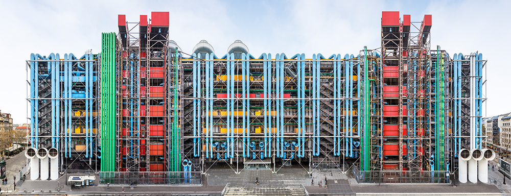
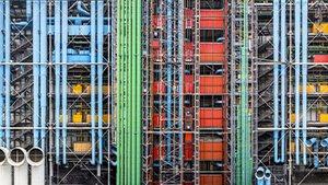
If Paris were a painting, its palette would be a muted one: the grey of zinc rooftops, charcoal asphalt, and the beige of cut-stone Haussmannian façades. Even today, the bold tones of the Centre Pompidou stand out sharply against the surrounding architecture of the Beaubourg district. More than just decorative, these colours are functional: blue signals air conditioning, yellow stands for electricity, green for water, red for the lifts, and white for the structural frame.
But the Centre Pompidou wasn’t always destined to be such a vibrant presence on the Parisian skyline. In its original design, the façade was to be a “three-dimensional wall” animated by screens and projections overlooking the square—a vision that never came to fruition. When that idea was abandoned, colour entered the picture.
The Centre Pompidou wasn’t always destined to be such a vibrant presence on the Parisian skyline. In its original design, the façade was to be a “three-dimensional wall” animated by screens and projections overlooking the square—a vision that never came to fruition. When that idea was abandoned, colour entered the picture.
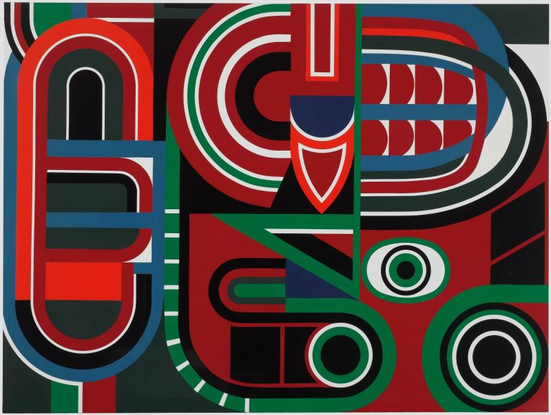
Much of the Centre’s chromatic identity can be traced back to the painter Jean Dewasne (1921–1999), a leading figure in French constructive abstraction and a close ally of the architectural world. It was he who convinced Renzo Piano and Richard Rogers to introduce colour into their design. His method? A visit to his studio in the Marais, where he had painted his own network of pipes in vivid hues—an environment that delighted and inspired his guests. As Dewasne recalled in an interview quoted by the Bibliothèque publique d’information (Bpi): “I explained how a new kind of architecture like this needed to be coloured—and with pure colours. […] They unanimously decided to use that as their model, because suddenly the issue seemed obvious: the Centre Pompidou would be in colour. And so, Beaubourg became my largest anti-sculpture.”
Colour as a Political Matter
Just weeks after personally approving the winning design for the Centre Pompidou, President Georges Pompidou’s office sent a note to his Minister of Cultural Affairs—a document now on view in the exhibition. The model he had been shown was white, and Pompidou expressed the wish to bring in a few renowned colourists.
This marked the beginning of a curious “battle of colours” that would play out over several months, pitting artists against political decision-makers. Pompidou initially suggested a few names from the Op Art movement: the Franco-Hungarian Victor Vasarely, the Venezuelan Carlos Cruz-Diez, and the Israeli Yaacov Agam—whom he had recently commissioned to create a decorative work for the antechamber of the Élysée Palace’s private apartments (now part of the national collection). The president also mentioned his fondness for Georges Braque’s colour palette: “If we are to lean toward a brown and blue combination, I would suggest light brown and blue, or a pale blue-grey of the kind found in Braque’s lithographs.”
Robert Bordaz, one of the founding figures of the Centre Pompidou and its first president (1970–1977), later reflected on this colourful confusion:
“By the end of 1971, I had consulted a number of artists, including Vasarely. I was convinced that architects, however talented, are not necessarily great colourists. Vasarely kindly suggested a metal framework in gold and blue. It was a tempting idea, but also an expensive one. Moreover, it failed to win over either the architects or the future users. The architects then proposed a yellow and blue scheme, which pleased no one. Vasarely subsequently noted that if gold was too costly, silver might be used instead. That effectively brought us back to the natural colour of metal—favoured by Pontus Hulten, but not by the architects.” (in Le Centre Pompidou – Une Nouvelle Culture, 1978)
A Simple Solution by Renzo Piano
In the end, as discussions stalled—as Claude Mollard recounts in his book L’Épopée Beaubourg. De la genèse à l’ouverture, 1971–1978 (published by the Centre Pompidou)—it was Renzo Piano who saved the day with a simple idea: to stick to primary and secondary colours, each corresponding to a specific function, as in an industrial building. And so Beaubourg took on its current colour scheme—a discreet tribute to the work of Le Corbusier and Fernand Léger—and narrowly avoided a few questionable shades along the way.
Today, this colour code still governs not only the façade but also the Centre’s hidden spaces, from the basements to the boiler rooms. Even the electrical transformers are carefully painted. On closer inspection, though, a few inconsistencies appear: the most striking is the white colour of the cooling towers on the roof. They should logically be blue, since they’re part of the air conditioning system—but that was without counting on the intervention of Valéry Giscard d’Estaing, who, after his election, insisted they be repainted white.
The Centre Pompidou’s Other Colour Code: Signage
Lesser known but just as essential: graphic designer Jean Widmer—the creator of the Centre Pompidou’s logo—was also tasked with designing the building’s first interior signage system. Together with colour specialist Jacques Fillacier, they decided to assign a distinct colour to each department: green for the Bibliothèque publique d’information (Bpi), blue for the Centre de Création Industrielle, red for the visual arts department, yellow for administration, and… purple for Ircam (Institut de Recherche et de Coordination Acoustique/Musique).
Jean Widmer initially faced strong opposition from Pierre Boulez, then head of Ircam, who found the colour “hideous and funereal.” Boulez eventually agreed to a slightly more crimson version—after first proposing a “Mercedes metallic grey.” A masterclass in resolving conflict without missing a beat. ◼
Related articles
![[Translate to English:]](/fileadmin/_processed_/9/8/csm_chenille-vignette_braun_ccc5d5c183.jpg "[Translate to English:]")
In the calendar
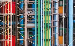
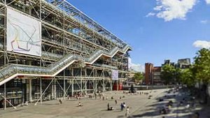
Façade du Centre Pompidou, côté rue du Renard.
Photo © Sergio Grazia
Jean Dewasne, Sans titre, vers 1970
Laque sur isorel, 96,5 x 130 cm
© Adagp, Paris
Centre Pompidou, Mnam-Cci/Dist. GrandPalaisRmn
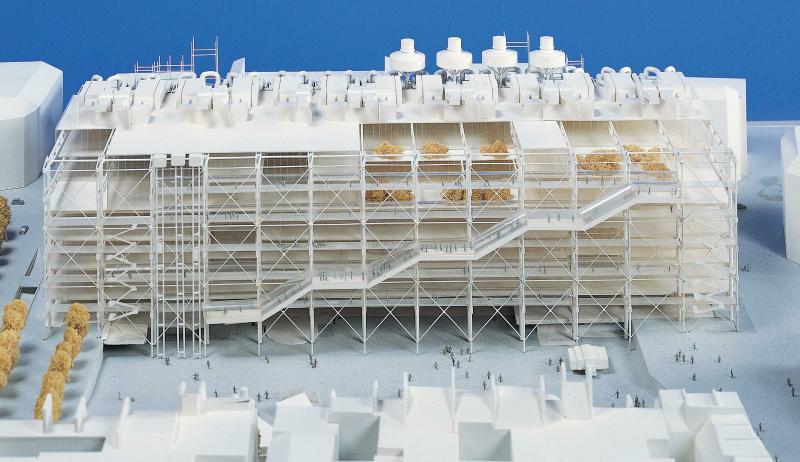
Renzo Piano, Richard Rogers, Maquette d'étude pour le Centre Pompidou (1971 - 1977)
Don de Renzo Piano Building Workshop (RPBW), 1992